
Hey there!
Just a short note before the introduction: when I first started writing this blog post, I was going into great detail about each screen in the application. Then, I realized that might be a bit dull for you to read. After all, there are tons of case studies out there that cover similar topics. They probably do a better job than I could hope to so I decided to change my focus. As a result, I present to you the challenges we faced during the project.
In the end, I didn’t even talk about the application much. Maybe I’ll have to write another post. 🤷♂️ Nevertheless, hope you enjoy reading this one!
The rise of smart sensors
In the era of rapid digital transformation, the integration of smart sensors in buildings has revolutionized various industries. These sensors enable real-time monitoring of occupancy, energy consumption, air quality, and security. They optimise resource utilization, enhancing comfort, and improving overall building efficiency.
These intelligent devices provide valuable data insights and automate processes, leading to better efficiency and decision-making. However, the seamless deployment and management of smart sensors require a well-designed provisioning* app that technicians use to set them up.
*For those who are not familiar - in the context of smart sensors, provisioning refers to the process of configuring and setting up a sensor for its intended purpose and network connectivity. In most cases, sensors can be edited or reconfigured after they have been provisioned.
Collaboration and synergy
The embedded team at Suprabit was already working on the firmware for the Smart sensor. During this time, our client, a Swiss-based smart building premier solutions provider, recognized a need for a user-friendly provisioning app. This app would help their technicians deploy and manage smart sensors easily. As a result, they asked us to design and develop a mobile app.
We embraced the challenge and took a unique approach to the development process. We designed and developed both the application and the firmware in the same team. This is, unfortunately, often not possible with IoT devices, since oftentimes different agencies work on firmware, application and design. But, the ability to approach the design and development of the app alongside the firmware team proved great. We had a thoughtful and iterative design process by keeping apps and firmware teams in sync.
Team effort
Since we were already working on multiple projects before, our tight-knit team had excellent synergy, aiding frequent collaboration and problem-solving.
This allowed us to address technical questions about hardware or firmware quickly and efficiently. Either by turning to a team member or through a short Discord call if we were working remotely. During the design and development process, we used a highly iterative approach. To ensure a great provisioning experience for users, we needed to adjust the firmware code to incorporate design and application improvements. We also had to adjust the application and design to accommodate firmware improvements.
By working together so closely and having instant feedback, we were able to make the best design choices. In the end, we created a high-quality, user-friendly provisioning app that met our client’s needs and exceeded their expectations.
”Through this synergy of different fields, we were able to create a provisioning process that neither application developers, firmware developers nor designers could come up with on their own.
”
Don't ignore UX
There's this thing that infuriates me about applications that are highly specialized and made for a specific audience. More often than not, they completely overlook the importance of user experience. It is usually assumed that they can simply refer to some kind of manual or figure out how the process is working by trial and error - it’s not like they can switch and use some other application.
From the get-go, we believed that applications should always be easy and enjoyable to use, regardless of the user or number of users. The app's entire process should be understandable from the moment it is first opened. In fact, we aimed to make the app so intuitive that the process would be understandable from the first time you open the app.
The early stages
In the early stages, we focused on iterating rapidly, emphasizing user experience (UX) over polishing the user interface (UI). This approach allowed us to identify potential issues early and make necessary adjustments. This turned out great because there were numerous changes during this process. By not spending time on UI, we were able to move faster and more efficiently.
Our approach to the development process was highly iterative. We mock-tested bad designs early on, which allowed us to identify and rectify potential issues before spending too much time polishing the UI. This approach proved to be highly effective, and we moved faster and more efficiently toward a user-friendly application.
Throughout this period, all teams communicated constantly about the possibilities and limitations of sensor hardware and application. This was a crucial step, as it allowed all the teams to work as one big team and understand the possibilities ahead of us.
With the goal of ensuring simplicity and error-proofing, we designed the provisioning process to be as seamless as possible. Our foremost objective was to prevent technicians from accidentally locking the sensor with the wrong configuration.
Unfortunately (or luckily, regarding who you ask), we couldn’t just “copy” a UX/UI design for provisioning from Behance or Dribble because no one had done anything similar before.
My Precious: The LED ring
The first step in designing the provisioning process was to determine the hardware's possibilities and limitations.
The first obstacle we encountered is that sensors are typically set up in two steps by two people. First, they mount and power them on, and then they provision them.
The issue here was identifying the sensors in the app during the second step. With multiple unprovisioned sensors on the same floor, the technician needs to make precise identification of the sensor they plan to provision.
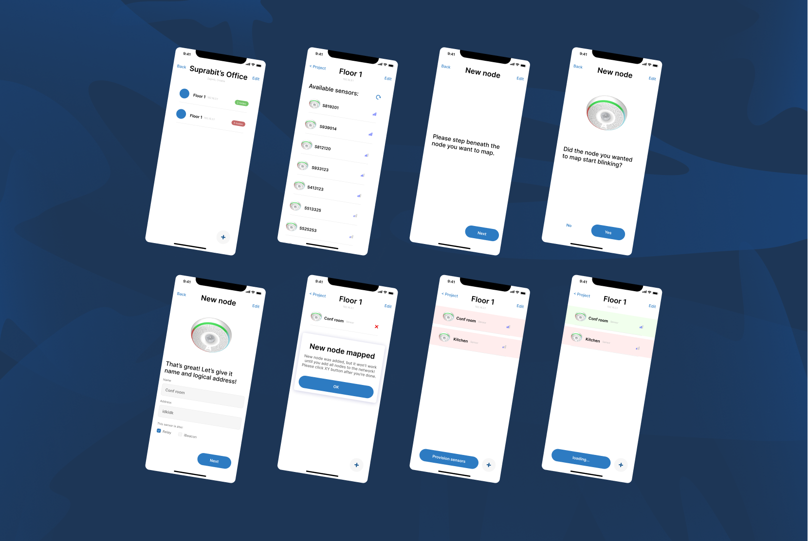
After consideration and brainstorming, we came to the conclusion that sensors should advertise their unique ID in the wild until provisioning is over. The app catches the ID and assigns a color to each sensor. The, LED ring on the sensor displays the assigned color to the technician in real-time.

This makes identifying the sensor easy, showing the technicians where the sensors are located on the ceiling. This ensures that the states in the app and in the real world are consistent.
This solution seems obvious now, but it was a crucial step in designing a user-friendly provisioning experience.
The Locking Puzzle: The provisioning process
The problem
The next issue we stumbled upon was the locking of the sensors. Instead of sending their data through Wi-Fi or Ethernet (eliminating the need to set up cables or access points throughout the building), the sensors create a Bluetooth mesh network that transmits data to the gateway sensor that's connected to the internet.
Since sensors are provisioned into a Bluetooth mesh, the app can only communicate with them via Bluetooth during provisioning. Once the process is complete, they begin using Bluetooth to communicate with other sensors in the same mesh network. If there's an incorrect configuration, someone has to manually hard reset the sensors by pressing a device button. This is never ideal, especially when sensors are mounted on a high ceiling in a commercial space.
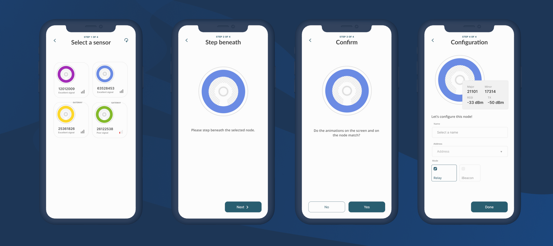
Through this process, a backbone of the design was created: a four-step provisioning process.
The process
Once a project (such as a single building) has been created, technicians can create networks for sensors to communicate on. These networks can be created per floor, or according to the client's requirements.
-
The first step to provisioning sensors is selecting the one you wish to provision. The application displays all unprovisioned sensors in the surrounding area. Each sensor has a unique color to aid the technician in selecting the correct sensor based on real-world data.
-
The following step prompts the technician to stand beneath the sensor. This step is crucial to ensure the strongest possible connection with the sensor.
-
After confirming their position, an animation will begin that is visible both in the app and on the real-world sensor. This step is essential to ensure the provisioning of the correct sensor. While this may seem unnecessary, we want to empower technicians to be certain in their actions and minimize any potential for errors.
-
In the final step, the user can add configuration for the selected sensor.
Designing with intent
For the provisioning process, we designed an icon for the smart sensor that changes color based on the color of real-world sensors. In the initial designs, we were just using simple colored circles to represent sensors. At first glance, this “illustration” may seem over-complicated. However, in initial tests, we noticed it allowed first-time users to make a stronger mental connection between the physical sensor and its representation in the application.

Sometimes we want to abstract real-world elements to their bare minimum, simplifying them to basic shapes or symbols. However, the experience we had with the smart sensor icon reminds us of the importance of designing with intent. It highlights the significance of considering the users' cognitive processes and their ability to make connections between physical objects and their digital representations. By intentionally designing icons or visual elements that align with users' mental models and facilitate comprehension, we enhance user experiences and foster a deeper understanding of the system or product. This emphasizes the value of purposeful design decisions that prioritize user engagement over mere visual aesthetics.
Language is also design?!
Once one or multiple sensors have been configured, they must be provisioned into a Bluetooth mesh. In this step, we learned a valuable lesson about thoughtful design and language's impact on user interactions. The irreversible nature of provisioning sensors into the network posed unique challenges which made careful consideration essential.
We firmly believe that good design goes beyond just aesthetics; it extends to the words we choose to communicate with users. The terminology used can profoundly impact how users perceive and navigate an application. Hence, we dedicated time to ponder the best way to name each action during the provisioning process.
For those not familiar with the context, provisioning refers to configuring and setting up a sensor for its intended purpose and network connectivity.
Unlike most cases, our sensors couldn't be edited or reconfigured once provisioned, which led us to avoid using the term "Provision" altogether. We were mindful not to introduce any connotations that word might have with technicians and cause confusion. Instead, we adopted "Configure" to signify the initial setup of sensors, and "Lock" for the actual process of provisioning them into the network.
To remove any confusion, we even went a step further and displayed the word "Lock" only on the popup window informing the user about the consequences of the action they were about to perform, and used a lock icon on the button.
Rethinking Symbolism
However, we soon realized that our approach had unintended consequences. The term "Lock" and its icon on the button created confusion among our initial test group. The symbolism of the lock did not represent a clear action. It didn't align with the actions technicians were accustomed to, and many of them forgot to press it. This left the provisioning incomplete. Despite explanations, they frequently missed the step, making it clear that the process wasn't intuitive enough.
Recognizing the need for a different approach, we decided to revamp the buttons. Instead of the lock icon, we introduced a clear "Finalize Provision" button. By incorporating a term familiar to technicians, the significance of finishing the provisioning process became more evident, and as a result, their memory lapses ceased to be an issue.

This experience taught us the immense importance of user-centric design. By understanding the specific context and needs of our users, we were able to craft a more intuitive and seamless provisioning process. It reinforced our belief that language and design must work harmoniously to create a truly user-friendly application. Through constant iteration and a willingness to learn from feedback, we successfully transformed a potentially confusing experience into a smooth and efficient one for our users.
Conclusion
In conclusion, the process of designing a smart sensor provisioning app not only taught us the significance of collaboration and user-centric design but also highlighted the profound impact of intentional language and iconography. By addressing challenges proactively and focusing on delivering a seamless and enjoyable experience, we successfully crafted a high-quality, user-friendly app that surpassed expectations. As technology continues to evolve, the lessons from this journey will undoubtedly serve as a strong foundation for future endeavors in designing innovative and user-centric applications.
UI/UX Designer & Full Stack Developer
If you like this article, we're sure you'll love these!


Smart Sensor - Case Study
Read all about how we reinvented the Smart Building Industry using our IOT, design and development expertise.


Decentralized Stable Coins
Explore MakerDAO's impact on DeFi and stablecoins, ensuring DAI's stability and robust governance.